Chapter 6
Item types
This chapter introduces the item types that can be used in TkZinc. Each item type provides a set of options
that may be used to query or change the item behavior. Some item types cannot be used with some widget
commands, or use special parameters with some commands. Those cases are noted in the description of the
item.
6.1 Group items
Group items are used for grouping objects together. Their usage is very powerfull and their use is best described in the previous chapter Groups, Display List, Clipping and Transformations .
Applicable attributes for group are:
-alpha alpha
Specifies the transparency to compose with the children transparencies. Needs the openGL extension.
-atomic boolean
Specifies if the group should report itself or its components during a search or for binding related operations. This attribute enable the use of a group as a single complex object build from smaller parts. It is possible to search for this item or use it in bindings without dealing with its smaller parts. The defaut value is false.
-catchevent boolean
Specifies if the item should block and possibly react to events or be transparent event wise. If a group is not catching events, its children will not receive events for processing regardless of their own state. The default value is true.
-clip item
The item used to clip the children of the group. The shape of this item define an area that is used as a clipping shape when drawing the children of the group. Most items can be used here but notable exceptions are the reticle and map items. The default value is "" which means that no clipping will be performed.
-composealpha boolean
Specifies if the alpha value inherited from the parent group must be composed with the alpha of this group. The default value is true.
-composerotation boolean
Specifies if the current rotation should be composed with the local transform. The default value is true.
-composescale boolean
Specifies if the current scale should be composed with the local transform. The default value is true.
-priority priority
The absolute position in the stacking order among siblings of the same parent group. The default value is 1.
-sensitive boolean
Specifies if the item and all its children should react to events. The defaut value is true.
-tags taglist
The list of tags associated with the item. The default value is "".
-visible boolean
Specifies if the item and all its children is displayed. The defaut value is true.
6.2 Track items
Track items have been designed for figuring out typical radar information for Air Traffic Control. However they may certainly be used by other kinds of radar view and surely by other kind of plan view with many moving objects and associated textual information.
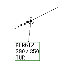
A track is composed of two main parts:
- The first one is purely graphic and is composed of many parts, some of them being identified
by their “partName”:
- the current position of the object. Its partName is position.
- a speed vector which size depends on the attribute -speedvector for the track and the option -speedvectorlength . This speed vector may be set visible or not, sensitive or other attributes can be set such as color, width, ticks, mark at the end... Its partName is speedvector.
- a leader which links the current position to the label. The leader may be visible or not, sensitive or not, and other graphic characteristics can be modified. Its partName is leader.
- past positions which are previous position after the track has been moved by the coords command. The number of such past positions, their visibility and other graphic characteristics can be be modified. This part is never sensitive.
- a marker, which is a circle around the current position. This marker can be visible or not and other graphic characteristics can be configured. The marker is never sensitive.
- a connection, which is a link with another track or waypoint item; links are drawn between their current position. This connection may be visible or not, sensitive or not, and other graphic characteristics can be be modified. Its partName is connection.
- the second part is a block of texts described by a labelformat (see chapter Labels, labelformats, and fields . Each text can have its graphic decorations (alignment, background, images, borders...). These attributes are listed in the chapter Labels, label formats and fields and can be changed by the command itemconfigure .
The following picture shows a simple track with a label of 5 fields and 5 past positions. This track also shows a marker, the circle around the current position.
An other very important feature of track item is that TkZinc offers an anti-overlap manager. This manager tries to avoid any overlap of tracks labels. It also avoids that the label overlap the speedvector. This manager is stable over time: there should be few cases where labels are moved to a very different position. This manager applies to all tracks included in a group (by default the group 1). It can be enabled/disabled with the TkZinc attribute -overlapmanager . New labels positions are computed by the overlap manager every time a track is moved, a track is created or destroyed and every time the TkZinc widget is resized. Due to software license limitation, TkZinc do not include the very last version of this anti-overlap manager. If you are interested in this anti-overlap manager, please contact Didier Pavet at pavet@cena.fr.
Track items can be linked together or to waypoint items. The line figuring the link is configurable.
Applicable attributes for track are :
-catchevent boolean
Specifies if the item should block and possibly react to events or be transparent event wise. The default value is true.
-circlehistory boolean
If set to true the track history will be plotted as circles otherwise it will be plotted as squares. The default value is false.
-composealpha boolean
Specifies if the alpha value inherited from the parent group must be composed with the alpha of this item. The default value is true.
-composerotation boolean
Specifies if the current rotation should be composed with the local transform. The default value is true.
-composescale boolean
Specifies if the current scale should be composed with the local transform. The default value is true.
-connecteditem item
The track or waypoint item at the other end of the connection link. The default value is "" which means that no connection link will be drawn.
-connectioncolor gradient
The uniform (possibly transparent) color of the connection link. The first color of a real gradient color will be used. The default value is the current value of the widget option -forecolor .
-connectionsensitive boolean
Specifies if the connection link is sensitive. The actual sensitivity is the logical and of this attribute and of the item -sensitive attribute. The default value is true.
-connectionstyle linestyle
The line style of the connection link. The default value is simple.
-connectionwidth dimension
The width of the connection link. The default value is 1.
-filledhistory boolean
If set to true the track history will be filled otherwise it will be outlined. The default value is true.
-filledmarker boolean
If set to true the circular marker will be filled otherwise it will be outlined. The default value is false.
-frozenlabel boolean
Specifies if the label should be frozen at its current location to prevent the anti overlapping system from moving it. The default value is false.
-historycolor gradient
The uniform (possibly transparent) color of the track history. The first color of a real gradient color will be used. The default value is the current value of the widget option -forecolor .
-historywidth dimension
The starting width for drawing the monotonically shrinking track history. The default value is 8. This value used to be derived from the -symbol width, proscribing the use of large symbols.
-labelanchor anchor
The anchor used in positionning the label. The default value is center.
-labelangle angle
The angle in degrees between the label anchor and the normal to the speed vector. This attribute works with the -labeldistance attribute to specify a position for the label anchor with respect to the item origin. There is another alternative method for label positioning which is implemented with the -labeldx and -labeldy methods. Simultaneous use of the two methods should be done with care as there is no automatic update of values from the -labeldx , -labeldy set to the -labeldistance , -labelangle set. The default value is 20.
This attribute is a pass through to the anti-overlap module intended to select the convergence method. The exact meaning is left to the designer of the anti-overlap module actually used. The default value is 0.
-labeldistance dimension
The minimum distance in pixels between the track position and the label anchor. See the explanation of the -labelangle attribute for some more details. The default value is 50.
-labeldx dimension
The X offset between the track position and the label anchor. The default value is computed from the values in the -labeldistance and -labelangle attributes.
-labeldy dimension
The Y offset between the track position and the label anchor. The default value is computed from the values in the -labeldistance and -labelangle attributes.
-labelformat labelformat
Geometry of the label fields. The default value is "" which means that no label will be displayed.
-labelpreferredangle angle
XXX New. To be documented. The default value is ??.
-lastasfirst boolean
If set to true, the last position in the history will be drawn in the same color as the current position instead of being drawn in the history color. The default value is false.
-leaderanchors leaderanchors
The attachment of the leader on the label left or right side (whether the label is on the right or left of the current position). The default value is "" which means that the leader anchor is at the label center, whatever the label position.
-leadercolor gradient
The uniform (possibly transparent) color of the label leader. The first color of a real gradient color will be used. The default value is the current value of the widget option -forecolor .
-leaderfirstend lineend
Describes the arrow shape at the current position end of the leader. The default value is "".
-leaderlastend lineend
Describes the arrow shape at the label end of the leader. The default value is "".
-leadersensitive boolean
Specifies if the label leader is sensitive. The actual sensitivity is the logical and of this attribute and of the item -sensitive attribute. The default value is true.
-leadershape lineshape
The shape of the label leader. The default value is straight.
-leaderstyle linestyle
The line style of the label leader. The default value is simple.
-leaderwidth dimension
The width of the label leader. The default value is 1.
-markercolor gradient
The uniform (possibly transparent) color of the circular marker. The first color of a real gradient color will be used. The default value is the current value of the widget option -forecolor .
-markerfillpattern bitmap
The pattern to use when filling the circular marker. The default value is "".
-markersize dimension
The (scale sensitive) size of the circular marker. The default value is 0 which turn off the display of the marker.
-markerstyle linestyle
The line style of the marker outline. The default value is simple.
-mixedhistory boolean
If true the track history will be plotted with dots every other position. The default value is false.
-numfields unsignedint
Gives the number of fields available for the label. This attribute is read only.
-position point
The current location of the track. The default value is "0 0".
-priority priority
The absolute position in the stacking order among siblings of the same parent group. The default value is 1.
-sensitive boolean
Specifies if the item should react to events. The default value is true.
-speedvector point
The speed vector  x and y in unit / minute. The default value is "0 0" which results
in no speed vector displayed.
x and y in unit / minute. The default value is "0 0" which results
in no speed vector displayed.
-speedvectorcolor gradient
The uniform (possibly transparent) color of the track’s speed vector. The first color of a real gradient color will be used. The default value is the current value of the widget option -forecolor .
-speedvectormark boolean
If set a small point is drawn at the end of the speed vector. The point is drawn with the speed vector color. The default is false.Not yet available without openGL
-speedvectorsensitive boolean
Specifies if the track’s speed vector is sensitive. The actual sensitivity is the logical and of this attribute and of the item -sensitive attribute. The default value is true.
-speedvectorticks boolean
If set a mark is drawn at each minute position. The default is false. Not yet available without openGL
-speedvectorwidth dimension
New. XXX To be documented. The default value is 1.
-symbol bitmap
The symbol displayed at the current position. The default value is the current value of the widget option -tracksymbol .
-symbolcolor gradient
The uniforme (possibly transparent) color of the symbol displayed at the current position. The first color of a real gradient color will be used. The default value is the current value of the widget option -forecolor .
-symbolsensitive boolean
Specifies if the current position’s symbol is sensitive to events. The actual sensitivity is the logical and of this attribute and of the item -sensitive attribute. The default value is true.
-tags taglist
The list of tags associated with the item. The default value is "".
-visible boolean
Specifies if the item is displayed. The default value is true.
-historyvisible boolean
Specifies whether the item should display its history according to the options -trackvisiblehistorysize and -trackmanagedhistorysize . The default value is true.
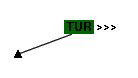
6.3 WayPoint items
Waypoints items have been initially designed for figuring out typical fixed position objects (i.e. beacons or fixes in the ATC vocabulary) with associated block of texts on a radar display for Air Traffic Control. They supports mouse event handling and interactions. However they may certainly be used by other kinds of radar view or even by other kind of plan view with many geographical objects and associated textual information.
A waypoint is composed of the following parts:
- the position of the waypoint. Its partName is position.
- a leader which links the current position to the label. The leader may be visible or not, sensitive or not, and other graphic characteristics can be be modified. Its partName is leader.
- a label which is a block of texts described by a labelformat (see chapter Labels, labelformat, and fields . Each text can have its graphic decorations (alignment, background, images, borders...). These attributes are listed in the chapter Labels, label formats and fields and can be changed by the command itemconfigure .
- a connection, which is a link with another waypoint or track item. This connection may be visible or not, sensitive or not, and other graphic characteristics can be be modified. Its partName is connection.
Applicable attributes for waypoint are:
-catchevent boolean
Specifies if the item should block and possibly react to events or be transparent event wise. The default value is true.
-composealpha boolean
Specifies if the alpha value inherited from the parent group must be composed with the alpha of this item. The default value is true.
-composerotation boolean
Specifies if the current rotation should be composed with the local transform. The default value is true.
-composescale boolean
Specifies if the current scale should be composed with the local transform. The default value is true.
-connecteditem item
The track or waypoint item at the other end of the connection link. The default value is "" which means that no connection link will be drawn.
-connectioncolor gradient
The uniform (possibly transparent) color of the connection link. The first color of a real gradient color will be used. The default value is the current value of the widget option -forecolor .
-connectionsensitive boolean
Specifies if the connection link is sensitive. The actual sensitivity is the logical and of this attribute and of the item -sensitive attribute. The default value is true.
-connectionstyle linestyle
The line style of the connection link. The default value is simple.
-connectionwidth dimension
The width of the connection link. The default value is 1.
-filledmarker boolean
If set to true the circular marker will be filled otherwise it will be outlined. The default value is false.
-labelanchor anchor
The anchor used in positionning the label. The default value is center.
-labelangle angle
The angle in degrees between the label anchor and the normal to the speed vector. This attribute works with the -labeldistance attribute to specify a position for the label anchor with respect to the item origin. There is another alternative method for label positioning which is implemented with the -labeldx and -labeldy methods. Simultaneous use of the two methods should be done with care as there is no automatic update of values from the -labeldx , -labeldy set to the -labeldistance , -labelangle set. The default value is 20.
-labeldistance dimension
The minimum distance in pixels between the way point position and the label anchor. See the explanation of the -labelangle attribute for some more details. The default value is 50.
-labeldx dimension
The X offset between the way point position and the label anchor. The default value is computed from the values in the -labeldistance and -labelangle attributes.
-labeldy dimension
The Y offset between the way point position and the label anchor. The default value is computed from the values in the -labeldistance and -labelangle attributes.
-labelformat labelformat
Geometry of the label fields. The default value is "" which means that no label will be displayed.
-leaderanchors leaderanchors
The attachment of the leader on the label left or right side (whether the label is on the right or left of the current position). The default value is "" which means that the leader anchor is at the label center, whatever the label position.
-leadercolor gradient
The uniform (possibly transparent) color of the label leader. The first color of a real gradient color will be used. The default value is the current value of the widget option -forecolor .
-leaderfirstend lineend
Describes the arrow shape at the current position end of the leader. The default value is "".
-leaderlastend lineend
Describes the arrow shape at the label end of the leader. The default value is "".
-leadersensitive boolean
Specifies if the label leader is sensitive. The actual sensitivity is the logical and of this attribute and of the item -sensitive attribute. The default value is true.
-leadershape lineshape
The shape of the label leader. The default value is straight.
-leaderstyle linestyle
The line style of the label leader. The default value is simple.
-leaderwidth dimension
The width of the label leader. The default value is 1.
-markercolor gradient
The uniform (possibly transparent) color of the circular marker. The first color of a real gradient color will be used. The default value is the current value of the widget option -forecolor .
-markerfillpattern bitmap
The pattern to use when filling the circular marker. The default value is "".
-markersize dimension
The (scale sensitive) size of the circular marker. The default value is 0 which turn off the display of the marker.
-markerstyle linestyle
The line style of the marker outline. The default value is simple.
-numfields unsignedint
Gives the number of fields available for the label. This attribute is read only.
-position point
The current location of the way point. The default value is "0 0".
-priority priority
The absolute position in the stacking order among siblings of the same parent group. The default value is 1.
-sensitive boolean
Specifies if the item should react to events. The default value is true.
-symbol bitmap
The symbol displayed at the current position. The default value is AtcSymbol15.
-symbolcolor gradient
The uniform (possibly transparent) color of the symbol displayed at the current position. The first color of a real gradient color will be used. The default value is the current value of the widget option -forecolor .
-symbolsensitive boolean
Specifies if the current position’s symbol is sensitive to events. The actual sensitivity is the logical and of this attribute and of the item -sensitive attribute. The default value is true.
-tags taglist
The list of tags associated with the item. The default value is "".
-visible boolean
Specifies if the item is displayed. The default value is true.
6.4 Tabular items
Tabular items have been initially designed for displaying block of textual information, organised in lists or spread out on a radar display.
A tabular item is mainly composed of a label which is a block of texts described by a labelformat (see chapter Labels, labelformats and fields . Each text can have its graphic decorations (alignment, background, images, borders...). This attributes are listed in the chapter Labels, label formats and fields and can be changed by the command itemconfigure . A tabular can be attached with the -connecteditem attribute to the label of a track , waypoint or another tabular .
Applicable attributes for tabular are:
-anchor anchor
The anchor used in positionning the item. The default value is nw.
-catchevent boolean
Specifies if the item should block and possibly react to events or be transparent event wise. The default value is true.
-composealpha boolean
Specifies if the alpha value inherited from the parent group should be composed with the alpha of this item. The default value is true.
-composerotation boolean
Specifies if the current rotation should be composed with the local transform. The default value is true.
-composescale boolean
Specifies if the current scale should be composed with the local transform. The default value is true.
-connecteditem item
Specifies the The track, waypoint or tabular item relative to which this item is placed. Connected item should be in the same group. The default value is "".
-connectionanchor anchor
Specifies the anchor on the connected item. The default value is sw.
-labelformat labelformat
Geometry of the label fields. The default value is "" which means that nothing will be displayed.
-numfields unsignedint
Gives the number of fields available for the label. This attribute is read only.
-position point
The item’s position relative to the anchor (if no connected item specified). The default value is "0 0".
-priority priority
The absolute position in the stacking order among siblings of the same parent group. The default value is 1.
-sensitive boolean
Specifies if the item should react to events. The default value is true.
-tags taglist
The list of tags associated with the item. The default value is "".
-visible boolean
Specifies if the item is displayed. The default value is true.
6.5 Text items
Text items are used for displaying text. They can also be used for text input. In this case, they must get the focus for keyboards events with the command focus . Many TkZinc options (see chapter Widget options can be used for configuring the text input (for example : -insertbackground , -insertofftime -insertontime , -insertwidth ).
With and without openGL, text items can be rotated or scaled. However, attributes -composerotation and -composescale must be set before rotation and scaling.
A Tcl module, zincText is available, it provides simple bindings for interactive text input. For enabling interactive text editing on an item, the item should be sensitive and should have the tag “text”.
A Perl module, called Tk::Zinc::Text (see the section Tk::Zinc::Text ) is provided for easing text input in text items (it can also be used for text input in labelled items such as track , waypoint or tabular ).
Applicable attributes for text are:
-alignment alignment
Specifies the horizontal alignment of the lines in the item. The default value is left.
-anchor anchor
The anchor used in positionning the item. The default value is nw.
-catchevent boolean
Specifies if the item should block and possibly react to events or be transparent event wise. The default value is true.
-color gradient
Specifies the uniform (possibly transparent) color for drawing the text characters, the overstrike and underline lines. The first color of a real gradient color will be used. The default value is the current value of the widget option -forecolor .
-composealpha boolean
Specifies if the alpha value inherited from the parent group should be composed with the alpha of this item. The default value is true.
-composerotation boolean
Specifies if the current rotation should be composed with the local transform. The default value is false.
-composescale boolean
Specifies if the current scale should be composed with the local transform. The default value is false.
-connecteditem item
Specifies the item relative to which this item is placed. Connected item should be in the same group. The default value is "".
-connectionanchor anchor
Specifies the anchor on the connected item. The default value is sw.
-fillpattern bitmap
Specifies the pattern used to draw the text characters, the overstrike and underline lines. The default value is "".
-font font
Specifies the font for the text. The default value is the current value of the widget option -font .
-overstriked boolean
If true, a thin line will be drawn horizontally across the text characters. The default value is false.
-position point
The item’s position relative to the anchor (if no connected item specified). The default value is "0 0" (Tcl/Tk) or [0,0] (Perl/Tk).
-priority priority
The absolute position in the stacking order among siblings of the same parent group. The default value is 1.
-sensitive boolean
Specifies if the item should react to events. The default value is true.
Specifies a pixel value that will be added to the inter-line spacing specified in the font. The value can be positive to increase the spacing or negative to reduce it. The default value is 0.
-tags taglist
The list of tags associated with the item. The default value is "".
-text string
Specifies the text characters. Newline characters can be embedded to force line ends. The default value is "".
-underlined boolean
If true, a thin line will be drawn under the text characters. The default value is false.
-visible boolean
Specifies if the item is displayed. The default value is true.
Specifies the maximum pixel width of the text, a line break will be automatically inserted at the closest character position to match this constraint. If the value is zero, the width is not under the item control and line breaks must be inserted in the text to have multiple lines. The default value is 0.
6.6 Icon items
Icon items are used for displaying bitmap images. Any bitmap file format supported by Tk can be used. If the bitmap file supports transparency (not alpha-blending, only full transparency), TkZinc will render this transparent area. With and without openGL, icons can be rotated or scaled. However, attributes -composerotation and -composescale must be set before rotation and scaling.
Applicable attributes for icon are:
-anchor anchor
The anchor used in positionning the item. The default value is nw.
-catchevent boolean
Specifies if the item should block and possibly react to events or be transparent event wise. The default value is true.
-color gradient
Specifies the uniform (possibly transparent) fill color used for drawing the bitmap. The first color of a real gradient color will be used. If The icon contains an image, only the transparency of the color is used and defines the alpha transparency of the image when -render is set to true. The default value is the current value of the widget option -forecolor .
-composealpha boolean
Specifies if the alpha value inherited from the parent group should be composed with the alpha of this item. The default value is true.
-composerotation boolean
Specifies if the current rotation should be composed with the local transform. The default value is false.
-composescale boolean
Specifies if the current scale should be composed with the local transform. The default value is false.
-connecteditem item
Specifies the item relative to which this item is placed. Connected item should be in the same group. The default value is "".
-connectionanchor anchor
Specifies the anchor on the connected item. The default value is sw.
-image image
Specifies a Tk image that will be displayed by the item. The image may have a mask (depend on the image format) that clip some parts. This option has precedence over the mask option if both are specified. The default value is "".
-mask bitmap
Specifies a Tk bitmap that will be displayed by the item. The bitmap is filled with the color specified with the color option. This option is inactive if an image has been specified with the image option. The default value is "".
-position point
The item’s position relative to the anchor (if no connected item specified). The default value is "0 0" (Tcl/Tk) or [0,0] (Perl/Tk.
-priority priority
The absolute position in the stacking order among siblings of the same parent group. The default value is 1.
-sensitive boolean
Specifies if the item should react to events. The default value is true.
-tags taglist
The list of tags associated with the item. The default value is "".
-visible boolean
Specifies if the item is displayed. The default value is true.
6.7 Reticle items
Reticle items are set of concentric circles. The number of circles can be either finite or not. Some periodic circles may be different, they are called bright circles; they can be configured differently from other circles. This item has mainly be designed for radar display images, to help user evaluationg distances from the central point. Reticle cannot handle events.
Applicable attributes for reticle are:
-brightlinecolor gradient
This is the uniform (possibly transparent) color of highlighted circles. The first color of a real gradient color will be used. The default value is the current value of the widget option -forecolor .
-brightlinestyle linestyle
This is the line style of the highlighted circles. The default value is simple.
-catchevent boolean
Specifies if the item should block and possibly react to events or be transparent event wise. The default value is false.
In the current implementation, this item will not react to events even if this attribute is set.
-composealpha boolean
Specifies if the alpha value inherited from the parent group should be composed with the alpha of this item. The default value is true.
-composerotation boolean
Specifies if the current rotation should be composed with the local transform. The default value is true.
-composescale boolean
Specifies if the current scale should be composed with the local transform. The default value is true.
-firstradius dimension
This is the radius of the innermost circle of the reticle. The default value is 80.
-linecolor gradient
This is the uniform (possibly transparent) color of regular (not highlighted) circles. The first color of a real gradient color will be used. The default value is the current value of the widget option -forecolor .
-linestyle linestyle
This is the line style of the regular (not highlighted) circles. The default value is simple.
-numcircles unsignedint
Specifies how many circles should be drawn. The default value is -1 which means draw as many circles as needed to encompass the current widget window. This does not take into account any possible clipping that can mask part of the reticle. The idea behind this trick is to draw an infinite reticle that is optimized for the current scale.
-period unsignedint
Specifies the recurrence of the bright circles over the regulars. The default value is 5 which means that a bright circle is drawn then 4 regulars, etc.
-position point
Location of the center of the reticle. The default value is "0 0".
-priority priority
The absolute position in the stacking order among siblings of the same parent group. The default value is 0.
-sensitive boolean
Specifies if the item should react to events. The default value is false as the item cannot handle events.
-stepsize dimension
The (scale sensitive) size of the step between two consecutive circles. The default value is 80.
-tags taglist
The list of tags associated with the item. The default value is "".
-visible boolean
Specifies if the item is displayed. The default value is true.
6.8 Map items
Map items are typically used for displaying maps on a radar display view. Maps are not be sensitive to mouse or keyboard events, but have been designed to efficiently display large set of points, segments, arcs, and simple texts. A map item is associated to a mapinfo. This mapinfo entity can be either initialized with the videomap command or more generally created and edited with a set of commands described in the The mapinfo related commands section.
Applicable attributes for map are:
-catchevent boolean
Specifies if the item should block and possibly react to events or be transparent event wise. The default value is false.
In the current implementation, this item will not react to events even if this attribute is set.
-color gradient
Specifies the uniform (possibly transparent) color used to draw or fill the map. The texts and symbols that are part of the map are also drawn in this color. The first color of a real gradient color will be used. The default value is the current value of the widget option -forecolor .
-composealpha boolean
Specifies if the alpha value inherited from the parent group should be composed with the alpha of this item. The default value is true.
-composerotation boolean
Specifies if the current rotation should be composed with the local transform. The default value is true.
-composescale boolean
Specifies if the current scale should be composed with the local transform. The default value is true.
-filled boolean
If set to true the map wil be filled otherwise it will be drawn as thin lines. The default is false.
-fillpattern bitmap
Specifies the pattern to be used when filling the map. The value should be a legal Tk bitmap. The default value is "".
-font font
Specifies the font that will be used to drawn the texts of the map. The default value is the current value of the widget option -maptextfont .
-mapinfo mapinfo
Specifies the lines, texts, symbols and other various graphical components that should be displayed by the map item. All these graphical components will share the graphical attributes (color, font, etc) of the item and its coordinate system. The default value is "" which means that nothing will be displayed by the map.
-priority priority
The absolute position in the stacking order among siblings of the same parent group. The default value is 0.
-sensitive boolean
Specifies if the item should react to events. The default value is false as the item cannot handle events.
-symbols bitmaplist
XXX to be detailed. The default value is ??.
-tags taglist
The list of tags associated with the item. The default value is "".
-visible boolean
Specifies if the item is displayed. The default value is true.
6.9 Rectangle items
Items of type rectangle display a rectangular shape, optionally filled. The rectangle is described by its bottom-left and top right corners.
It is possible to use this item as a clip item for its group. It is also possible to use the rectangle in a contour command to build a complex shape in a curve item. The two points describing the rectangle can be read and modified with the coords command.
Applicable attributes for rectangle are:
-catchevent boolean
Specifies if the item should block and possibly react to events or be transparent event wise. The default value is true.
-composealpha boolean
Specifies if the alpha value inherited from the parent group should be composed with the alpha of this item. The default value is true.
-composerotation boolean
Specifies if the current rotation should be composed with the local transform. The default value is true.
-composescale boolean
Specifies if the current scale should be composed with the local transform. The default value is true.
-fillcolor gradient
Specifies the color that will be used to fill the rectangle if requested by the -filled attribute. The default value is a one color gradient based on the current value of the widget option -forecolor .
-filled boolean
Specifies if the item should be filled. The default value is false.
-fillpattern bitmap
Specifies the pattern to use when filling the item. The default value is "".
-linecolor gradient
Specifies the uniform (possibly transparent) color used to draw the item outline. The first color of a real gradient color will be used. The default value is the current value of the widget option -forecolor .
-linepattern bitmap
Specifies the pattern to use when drawing the outline. The default value is "".
-linestyle linestyle
Specifies the line style to use when drawing the outline. The default value is simple.
-linewidth dimension
Specifies the width of the item outline (not scalable). The default value is 1.
-priority priority
The absolute position in the stacking order among siblings of the same parent group. The default value is 1.
-relief relief
Specifies the relief used to drawn the rectangle outline. This attribute has priority over the -linepattern and -linestyle attributes. The color of the relief is derived from the color in -linecolor . The default value is flat.
-sensitive boolean
Specifies if the item should react to events. The default value is true.
-tags taglist
The list of tags associated with the item. The default value is "".
-tile image
Specifies an image used for filling the item with tiles. This will be done only if filling is requested by the -filled attribute. This attribute has priority over the -fillcolor attribute and the -fillpattern attribute. The default value is "".
-visible boolean
Specifies if the item is displayed. The default value is true.
6.10 Arc items
Items of type arc display an oval section, optionally filled, delimited by two angles. The oval is described by its enclosing rectangle. The arc can be closed either by a straight line joining its end points or by two segments going throught the center to form a pie-slice.
It is possible to use this item as a clip item for its group, the clip shape will be the polygon obtained by closing the arc. It is also possible to use this polygon in a contour command to build a complex shape in a curve item. The two points describing the enclosing rectangle can be read and modified with the coords command. The first point should be the top left vertex of the rectangle and the second should be the bottom right.
Applicable attributes for arc are:
-catchevent boolean
Specifies if the item should block and possibly react to events or be transparent event wise. The default value is true.
-closed boolean
Specifies if the outline of the arc should be closed. This is only pertinent if the arc extent is less than 360 degrees. The default value is false.
-composealpha boolean
Specifies if the alpha value inherited from the parent group should be composed with the alpha of this item. The default value is true.
-composerotation boolean
Specifies if the current rotation should be composed with the local transform. The default value is true.
-composescale boolean
Specifies if the current scale should be composed with the local transform. The default value is true.
-extent angle
Specifies the angular extent of the arc relative to the start angle. The angle is expressed in degrees in the trigonometric system. The default value is 360.
-fillcolor gradient
Specifies the color used to fill the arc if requested by the -filled attribute. The default value is a one color gradient based on the current value of the widget option -backcolor .
-filled boolean
Specifies if the item should be filled. The default value is false.
-fillpattern bitmap
Specifies the pattern to use when filling the item. The default value is "".
-firstend lineend
Describes the arrow shape at the start end of the arc. This attribute is applicable only if the item is not closed and not filled. The default value is "".
-lastend lineend
Describes the arrow shape at the extent end of the arc. This attribute is applicable only if the item is not closed and not filled. The default value is "".
-linecolor gradient
Specifies the uniform (possibly transparent) color used to draw the item outline. The first color of a real gradient color will be used. The default value is the current value of the widget option -forecolor .
-linepattern bitmap
Specifies the pattern to use when drawing the outline. The default value is "".
-linestyle linestyle
Specifies the line style to use when drawing the outline. The default value is simple.
-linewidth dimension
Specifies the with of the item outline (not scalable). The default value is 1.
-pieslice boolean
This attribute tells how to draw an arc whose extent is less than 360 degrees. If this attribute is true the arc open end will be drawn as a pie slice otherwise it will be drawn as a chord. The default value is false.
-priority priority
The absolute position in the stacking order among siblings of the same parent group. The default value is 1.
-sensitive boolean
Specifies if the item should react to events. The default value is true.
-startangle angle
Specifies the arc starting angle. The angle is expressed in degrees in the trigonometric system. The default value is 0.
-tags taglist
The list of tags associated with the item. The default value is "".
-tile image
Specifies an image used for filling the item with tiles. This will be done only if filling is requested by the -filled attribute. This attribute has priority over the -fillcolor attribute and the -fillpattern attribute. The default value is "".
-visible boolean
Specifies if the item is displayed. The default value is true.
6.11 Curve items
Items of type curve display pathes of line segments and/or cubic bezier connected by their end points. A cubic Bezier is defined by four points. The first and last ones are the extremities of the cubic Bezier. The second and the third ones are control point (i.e. they must have a third “coordinate” with the value ’c’). If both control points are identical, one may be omitted. As a consequence, it is an error to have more than two succcessive control points or to start or finish a curve with a control point.
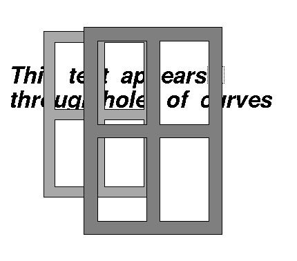
The polygon delimited by the path can optionally be filled. It is possible to build curve items with more than one path to describe complex shapes with the contour command. This command can be used to perform boolean operations between a curve and almost any other item available in TkZinc including another curve. The exact appearance of a multi-contour curve (i.e. which parts are filled and which are holes) depends on the value of an attribute, called -fillrule . In the following figure (a snapshot of zinc-demos ) two curves with four holes each are in front of a text. You can partially see the text through the holes.
It is possible to use this item as a clip item for its group, the clip shape will be the polygon obtained by closing the path. The vertices can be read, modified, added or removed with the coords command.
Applicable attributes for curve are:
-catchevent boolean
Specifies if the item should block and possibly react to events or be transparent event wise. The default value is true.
-capstyle capstyle
Specifies the form of the outline ends. This attribute is only applicable if the curve is not closed and the outline relief is flat. The default value is round.
-closed boolean
Specifies if the curve outline should be drawn between the first and last vertex or not. The default value is false.
-composealpha boolean
Specifies if the alpha value inherited from the parent group should be composed with the alpha of this item. The default value is true.
-composerotation boolean
Specifies if the current rotation should be composed with the local transform. The default value is true.
-composescale boolean
Specifies if the current scale should be composed with the local transform. The default value is true.
-fillcolor gradient
Specifies the color used to fill the curve if requested by the -filled attribute. The default value is a one color gradient based on the current value of the widget option -backcolor .
-filled boolean
Specifies if the item should be filled. The default value is false.
-fillpattern bitmap
Specifies the pattern to use when filling the item. The default value is "".
-fillrule fillrule
Specifies the way contours are combined together to specify complex surfaces, with holes and disjoint surfaces. The default value is "odd". This means that a point of the space is considered inside the curve surface if an odd number of contours are surrounding the point. This attribute should only be modified for curves with multiple or complicated contours.
-firstend lineend
Describes the arrow shape at the start of the curve. This attribute is applicable only if the item is not closed, not filled and the relief of the outline is flat. The default value is "".
-joinstyle joinstyle
Specifies the form of the joint between the curve segments. This attribute is only applicable if the curve outline relief is flat. The default value is round.
-lastend lineend
Describes the arrow shape at the end of the curve. This attribute is applicable only if the item is not closed, not filled and the relief of the outline is flat. The default value is "".
-linecolor gradient
Specifies the uniform (possibly transparent) color used to draw the item outline. The first color of a real gradient color will be used. The default value is the current value of the widget option -forecolor .
-linepattern bitmap
Specifies the pattern to use when drawing the outline. The default value is "".
-linestyle linestyle
Specifies the line style to use when drawing the outline. The default value is simple.
-linewidth dimension
Specifies the with of the item outline (not scalable). The default value is 1.
-marker bitmap
Specifies a bitmap that will be used to draw a mark at each vertex of the curve. This attribute is not applicable if the outline relief is not flat. The default value is "" which means do not draw markers.
-markercolor gradient
Specifies the uniform (possibly transparent) color of the markers. The first color of a real gradient color will be used. The default value is the current value of the widget option -forecolor .
-priority priority
The absolute position in the stacking order among siblings of the same parent group. The default value is 1.
-relief relief
Specifies the relief used to drawn the curve outline. This attribute has priority over the -linepattern and -linestyle attributes. The color of the relief is derived from the color in -linecolor . The default value is flat.
-sensitive boolean
Specifies if the item should react to events. The default value is true.
-smoothrelief boolean
Specifies if the relief should be smoothed along the curve. This is useful to obtain smooth curved reliefs instead of facets The default value is false.
-tags taglist
The list of tags associated with the item. The default value is "".
-tile image
Specifies an image used for filling the item with tiles. This will be done only if filling is requested by the -filled attribute. This attribute has priority over the -fillcolor attribute and the -fillpattern attribute. The default value is "".
-visible boolean
Specifies if the item is displayed. The default value is true.
6.12 Triangles items
Triangles items are used for displaying complexe surfaces with variables colors and transparencies. For example, it can be used to create a circular color selector displaying a range of colors. The way triangles composing a triangle item are arranged is defined by the -fan option.
This item has been added to provide access to a basic openGL geometric construction but it is also available in the X environment albeit with less features.
Applicable attributes for triangles are:
-catchevent boolean
Specifies if the item should block and possibly react to events or be transparent event wise. The default value is true.
-colors gradientlist
Specifies the colors of each vertex of the triangles. If the list has less colors than the number of vertices the last color is propagated on the remaining vertices. If the list contains colors in excess they are discarded.
-composealpha boolean
Specifies if the alpha value inherited from the parent group should be composed with the alpha of this item. The default value is true.
-composerotation boolean
Specifies if the current rotation should be composed with the local transform. The default value is true.
-composescale boolean
Specifies if the current scale should be composed with the local transform. The default value is true.
-fan boolean
If true, triangles are created with a fan like layout. Otherwise triangles are arranged like a strip. The default value is true.
-priority priority
The absolute position in the stacking order among siblings of the same parent group. The default value is 1.
-sensitive boolean
Specifies if the item should react to events. The default value is true.
-tags taglist
The list of tags associated with the item. The default value is "".
-visible boolean
Specifies if the item is displayed. The default value is true.
6.13 Window items
Items of type window display an X11 window at a given position in the widget.
It is possible to use this item as a clip item for its group, the clip shape will be the window rectangle. It is also possible to use the rectangular shape of the window item in a contour command to build a complex shape in a curve item. The position of the window, relative to the anchor, can be set or read with the coords command (i.e. if no connected item is specified).
One of the most frequent use of this item is to embed any Tk widget into TkZinc, including, of course, another TkZinc instance. Another less obvious use is to embed a whole Tk application into TkZinc, here is how to do it: The embedding application should create a frame with the -container option set to true; Add a window item to the relevant TkZinc widget with the -window attribute set to the id of the container frame; The embedded application should create its toplevel with the -use option set to the id of the container frame; Or, as an alternative, the embedded wish can be launched with the -use option set to the container frame id.
Applicable attributes for window items are:
-anchor anchor
The anchor used in positionning the item. The default value is nw.
-catchevent boolean
Specifies if the item should block and possibly react to events or be transparent event wise. The default value is true. It is not possible to actually turn off event catching when this attribute is reset. The events are caught by the embedded window and nothing can prevent this to happen.
-composealpha boolean
Specifies if the alpha value inherited from the parent group should be composed with the alpha of this item. The default value is true.
-composerotation boolean
Specifies if the current rotation should be composed with the local transform. The default value is true.
-composescale boolean
Specifies if the current scale should be composed with the local transform. The default value is true.
-connecteditem item
Specifies the item relative to which this item is placed. Connected item should be in the same group. The default value is "".
-connectionanchor anchor
Specifies the anchor on the connected item used for the placement. The default value is sw.
Specifies the height of the item window in screen units. The default value is 0.
-position point
The item’s position relative to the anchor (if no connected item specified). The default value is "0 0" (Tcl/Tk) or [0,0] (Perl/Tk).
-priority priority
Constraints of the underlying window system dictate the stacking order of window items. They can’t be lowered under the other items. Additionally, to manipulate their stacking order, you must use the raise and lower Tk commands on the associated Tk window. The value of this attribute is meaningless.
-sensitive boolean
This option has no effect on window items. The default value is false.
-tags taglist
The list of tags associated with the item. The default value is "".
-visible boolean
Specifies if the item is displayed. The default value is true.
Specifies the width of the item window in screen units. The default value is 0.
-window window
Specifies the X id of the window that is displayed by the item. This id can be obtained by the Tk command winfo id widgetname. The default value is "".
[front]